The handwritten letter has not declined. It has become rare, which is an entirely different thing — and rarity, in matters of communication as in matters of wine, is not the enemy of value but its amplifier. In an era when every message arrives in the same sans-serif typeface on the same backlit screen, a sheet of properly weighted paper written in a distinct hand carries the kind of singular presence that no digital communication can approach. It arrives as a physical object. It bears the pressure of another person’s hand. It cannot be sent in error, cannot be unsent, cannot be replied to in four seconds without thought.
This is not nostalgia talking. Nostalgia is a sentimental relationship with a past that probably wasn’t as good as remembered. What is being argued here is rather that the handwritten letter is the most direct and personal form of communication available — more so than a phone call, which leaves no trace; more so than an email, which leaves too much — and that choosing to write one is an act of respect for the recipient and for the act of thinking itself. You cannot write a proper letter without knowing what you want to say before you say it. The technology of pen and paper imposes the discipline of composition that every other medium now allows you to avoid.
The materials with which you write are part of this argument. Paper that resists the pen, ink that bleeds or fades, a nib that scratches rather than glides — these undermine the act from the beginning. The right materials make writing easier, which makes thinking easier. This is why they matter, and why knowing where to find them in Sydney is a form of practical wisdom.
Paper: The Foundation
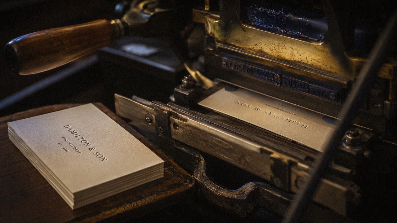
Paper quality in correspondence is experienced first by the recipient — the weight of the envelope in the hand, the feeling of the sheet itself, the way ink sits on the surface without spreading. The difference between eighty-gram office paper and a sheet of Clairefontaine Triomphe at ninety grams is not merely aesthetic; it is tactile, immediate, and communicates something about the writer’s intention before a single word is read.
Clairefontaine, the French manufacturer founded in 1858 in the Vosges, produces what many consider the benchmark European writing paper: the distinctive smooth vellum finish that gives excellent fountain pen performance without feathering, the restrained ivory that reads as serious rather than archaic. The Triomphe range — sold in pads and as individual sheets — is the everyday stationery of serious correspondents across Europe. In Sydney, it can be sourced through specialist bookshops and art supply retailers, as well as through local importers who carry the full range.
G. Lalo, the Parisian maison, operates at the more ceremonial end: laid and wove papers in the French tradition, watermarked, deckle-edged in some ranges, boxed with matching envelopes. For formal correspondence — the note of condolence, the letter of introduction, the thank-you that follows an exceptional dinner — G. Lalo occupies the correct register. The laid texture is legible to the recipient; it announces that the writer knows the difference.
For those who want the weight of a British heritage behind their paper, Smythson of Bond Street offers correspondence paper in their signature Nile Blue with deckle edge, available online and shipped to Sydney. A box of Smythson paper, personalised with name or monogram, represents an investment in correspondence infrastructure that pays out over years: the paper improves as the stack diminishes, knowing there are fewer sheets remaining concentrates the writing.
Pen: The Instrument
Peter’s of Kensington, the extraordinary housewares emporium in Sydney’s inner east, carries a significant range of fountain pens from the major European houses — Lamy, Waterman, Parker — providing a reliable introduction to the medium for those coming to it for the first time. But the city’s most serious pen culture lives elsewhere.
Chef’s Armoury in Stanmore — better known for Japanese knives — is a reminder that the best specialist retailers are driven by a coherent philosophy of craft rather than a category. The Japanese stationery culture that the store also represents points toward the other great pen-making tradition: Pilot, Sailor, and Platinum produce instruments of extraordinary precision at prices considerably below the European luxury houses, and the Pilot Metropolitan is still arguably the finest value fountain pen produced anywhere in the world.
Fountain Pens Online, Australia’s specialist mail-order dealer, provides access to the full depth of the market — from the Japanese craft nibs of Nakaya (hand-shaped from ebonite, the waiting list measured in months) to the solid German engineering of Pelikan’s Souverän range. For those beginning in fountain pens, a Pilot or Lamy Safari with a medium nib and a bottle of Diamine ink from the UK represents approximately sixty dollars invested in what may become one of the few genuinely lasting pleasures of the writing life.
The choice of ink deserves its own attention. Fountain pen ink has a chromatic range that no ballpoint can approach: the Diamine Registrar’s Ink in carbon black-blue was formulated to resist both water and document fraud; Iroshizuku, from Pilot’s Japanese premium range, offers inks named for nature — take-sumi (bamboo charcoal), shin-ryoku (fresh greens) — that carry the colour philosophy of traditional Japanese painting into the inkwell. For correspondence, a good blue-black is the classical choice; it reads as ink, not as a printing process, and ages beautifully on paper.
The Japanese Stationery Culture
The Japanese approach to stationery represents a third tradition alongside the English and French, and one that has developed a devoted following among Sydney’s culturally literate. The Hobonichi Techo — a pocket-sized daily planner printed on the near-translucent Tomoe River paper that is famously ink-resistant and feather-free — has become an object of near-devotional loyalty among certain writers and thinkers who understand that the physical act of maintaining a notebook is also the act of maintaining a mind.
Midori’s Traveler’s Notebook system — leather covers with elastic loops, refillable paper inserts — offers a modular architecture for those whose writing life spans notebooks, correspondence, and daily schedules in ways that resist single-purpose stationery. The leather cover acquires patina in the manner of all good leather objects; after a year in daily use it looks like what it is, which is something used with seriousness.
These brands can be sourced in Sydney through specialist Japanese stationery retailers and online through local importers. The community of Sydney fountain pen and stationery enthusiasts — who meet at pen club gatherings and share knowledge through online forums — is more extensive than its public profile suggests, and represents one of the more genuinely connoisseurial subcultures in the city.
The Protocol of the Handwritten Note
The single most effective gesture in any professional or personal relationship is the handwritten thank-you note sent within forty-eight hours of a significant meal, an introduction, or a professional favour. This is not manners in the genteel sense; it is communication strategy of the highest order. An email thanks the person; a handwritten note remembers them.
A few principles that serious correspondents observe:
Write on the front of the card or sheet only, unless the note is long enough to require the reverse, and if it requires the reverse, write a letter rather than a note.
Never apologise for your handwriting. Imperfect handwriting is a person’s handwriting; perfect copperplate is a performance.
The envelope matters. A handwritten address, a proper stamp (not a printed postage label), and your name and address on the reverse: these are not formalities but parts of the object’s coherence.
Ink should be dark enough to read easily. Royal blue or black-blue is universal; green or purple communicates something about personality that you may not have considered.
The brevity of a proper note — three sentences to five, no more — is not a limitation but an achievement. Every word must earn its place when there are so few of them.
Write the letter you would want to receive. Then write it in slightly better handwriting than you think you have.